Paraview basics#
1. Load the data#
Before proceeding with the visualisation of data in Paraview, the first step is to load the dataset. Paraview supports a broad range of file formats, including .VTU, .VTK, .CSV, .NetCDF, .e, and others. Among these, .VTU and .VTK are the most commonly used file formats, as they can store both the geometry and associated data (such as scalar, vector, or tensor fields).
The key distinction between .VTU and .VTK files lies in the type of data they represent. A .VTU file typically contains data for a single snapshot or time step, while a .VTK file can store multiple datasets or “situations” of data. For example, in the case of a transient simulation, each .VTU file represents the solution at one specific time step. When all the .VTU files (corresponding to different time steps) are combined, they can be converted into a single .VTK file. This transformation allows the visualisation of the solution over time, enabling dynamic exploration of time-varying data.
For the exodus format .e used as simulation output from Abaqus and MOOSE, it can be directly opened by Paraview.
To load your data:
Navigate to
File > Openand select the file you wish to load. Alternatively, you can simply drag and drop the file into the Paraview interface. Hint: When importing a series of.VTUfiles with logically numbered filenames, Paraview will automatically combine them into a single.VTKfile for easier visualisation.Once the file is loaded, the dataset will appear in the Pipeline Browser on the left side of the screen. From here, you can start applying filters and visualisations. The Pipeline Browser is an essential part of Paraview, displaying the structure of your current visualisation pipeline. It provides a hierarchical view of all the data sources, filters, and visual elements that make up your visualisation workflow. Each entry in the Pipeline Browser corresponds to a dataset (e.g., a
.VTUor.VTKfile), a filter (e.g., a clip or contour filter), or a rendering element (e.g., a 3D view of the data).To view and modify the properties of any selected data or filter, simply click on it in the Pipeline Browser. The selected item will be highlighted, and its properties will be displayed in the Properties Panel below. This panel shows a range of configurable options and attributes for the selected item, allowing for detailed adjustments. For example, we can extract element blocks, nodesets and variables. The properties panel is shown in figure 1 below.
To render the selected data or filter to your visualisation, click the Apply button in the Properties Panel.
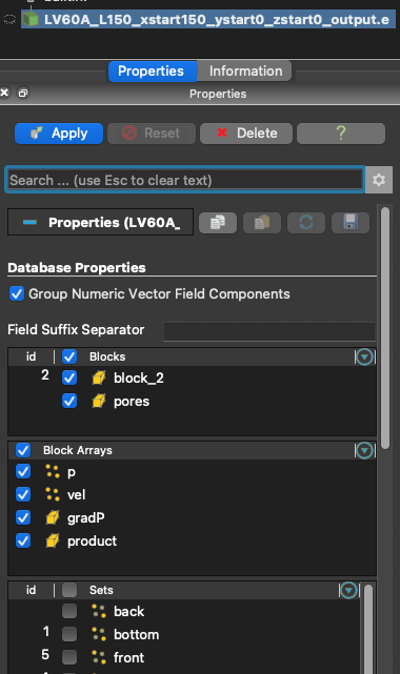
Fig. 10.1 The dataset appeared in the Properties Panel. Here we can extract element blocks, nodesets and variables. To render the selected data, click the Apply button.#
2. Scientific visualisation with coloring#
In scientific visualisation, coloring plays a key role in representing field data values in a way that enhances understanding and highlights important features. Paraview provides powerful tools for adjusting color maps, setting data value ranges, applying transparency, and displaying color bar legends. Below are some key techniques to customize the appearance of your visualisations:
Setting Data Value Range (or Automatic Rescaling)
Setting an appropriate data value range ensures that the color map accurately reflects the data’s range. You can either manually set the data range or let Paraview automatically rescale the color map based on the dataset’s values.Select the dataset or filter in the Pipeline Browser.
In the Properties Panel, under the Color Map section, set the Data Range to display the scalar values you are interested in.
If enabled, Automatic Rescaling adjusts the color map range automatically to fit the minimum and maximum values of the dataset at the selected timestep.
Changing Color Maps
The color map used in the visualisation is critical for interpreting scalar values. Paraview provides various built-in color maps that can be applied based on the type of data being visualised. To change the color map:Select the dataset or filter you want to visualise.
In the Properties Panel, under the Display section, click Edit Color Map (found in the Coloring drop-down menu).
You can choose from various predefined color maps like Cool to Warm, Rainbow, Jet, or customize a color map to better represent your data.
Apply Transparency to Colors
Transparency allows you to visualise the interior of objects or to better see overlapping structures in your dataset. To apply color transparency:Click on Edit Color Map.
Check the box Enable Opacity Mapping For Surfaces. The opacity is based on data values, allowing for more flexible visualisations.
Show and Edit Color Bar Legend
The color bar legend is an important visual element that shows the relationship between the data values and the colors in the visualisation. To display and customize the color bar legend:After selecting a dataset and applying a color map, right-click on the 3D view window and select Show Color Legend.
You can further customize the color bar by selecting it and adjusting its properties through the Color Legend Editor. This editor allows you to change the position, size, orientation, and labeling of the color bar to match your visualisation style and improve readability.
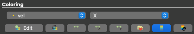
Fig. 10.2 In the Properties Panel, under Coloring, we can Edit the color map by clicking on the button “Edit”.#
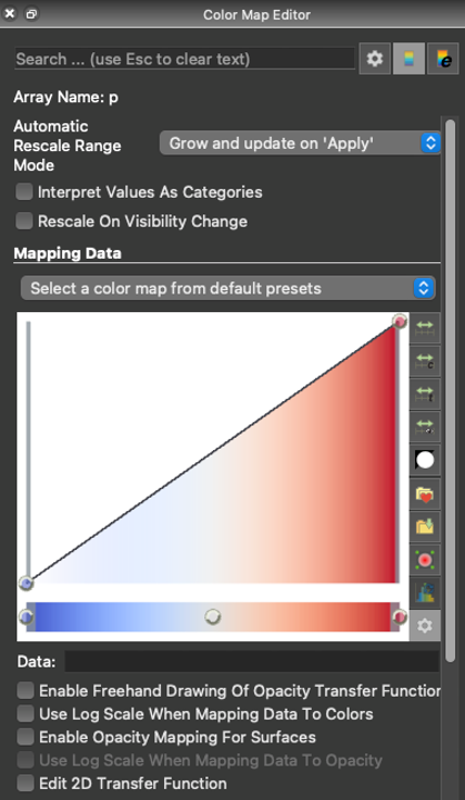
Fig. 10.3 When editing the color map, we can select pre-defined color maps (by clicking on “select a color map from default presets”) or adjust them ourselves.#
3. Augmented reality#
The great thing about Paraview is that there is not only coloring to visualise the data. Here, we describe 4 other commonly-used visualisation tools in Paraview: Contour, Glyph, Stream Tracer and Warp by Vector. We can find those from the filter menu: Filters > Common.
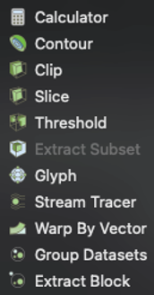
Fig. 10.4 The 4 commonly-used visualisation tools mentioned above can be found in the Filters menu.#
3.1. Contour#
The contour filter is used to create contour lines or surfaces that represent regions of constant scalar values within a dataset. It’s particularly useful for visualising scalar fields (such as temperature, pressure, or concentration). The contour surfaces provide insight into the distribution of scalar values and help identify key features, such as boundaries or transitions in the data. We can apply the filter from the Filters menu (Filters > Alphabetical > Contour). In the Properties Panel, specify the contour levels (scalar values) to visualise.
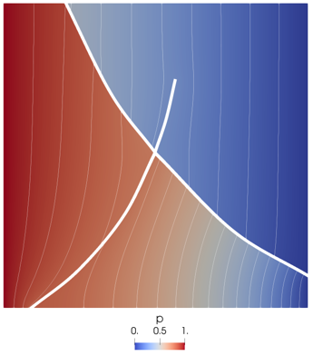
Fig. 10.5 An example of the contour filter used. Figure from Poulet et al. (2021)1.#
3.2. Glyph#
The Glyph filter is used to visualise vector fields (e.g., velocity, magnetic fields) by placing geometric shapes (called glyphs) at points in the dataset, oriented in the vector’s direction and scaled according to the vector’s magnitude. This helps in visualising the direction and strength of the vector field, often used in fluid dynamics or other simulations involving vector data. We can apply the Glyph filter from the filter menu (Filters > Alphabetical > Glyph). In the Properties Panel, choose the vector field to visualise and select the glyph shape (e.g., arrow). Adjust the Scale Factor to control the size of the glyphs.
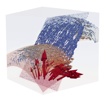
Fig. 10.6 Glyph visualization example. Figure from Poulet et al. (2021)1.#
3.3. Stream Tracer#
The Stream Tracer filter is used to generate streamlines (or stream tubes) from a vector field. Streamlines represent the flow paths that particles would follow in a vector field (such as fluid flow). This tool is commonly used in fluid dynamics to visualise the flow of fluids or gases. Apply the Stream Tracer filter from the filter menu (Filters > Alphabetical > Stream Tracer). In the Properties Panel, specify the Seed Points (initial points from which the streamlines will begin) and adjust the Integration Method and Step Size to control the trace accuracy.
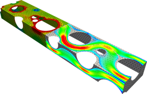
Fig. 10.7 Example of the streamtracer filter.#
3.4. Warp by Vector#
The Warp by Vector filter deforms the geometry of a dataset based on a vector field. It “warps” the data by shifting its points along the vectors, effectively distorting the shape of the dataset to visualise for example how a displacement vector field is affecting the structure. Apply the Warp by Vector filter from the filter menu (Filters > Alphabetical > Warp By Vector). In the Properties Panel, choose the vector field to use for the warping and set the Scale Factor to control the magnitude of the warp.
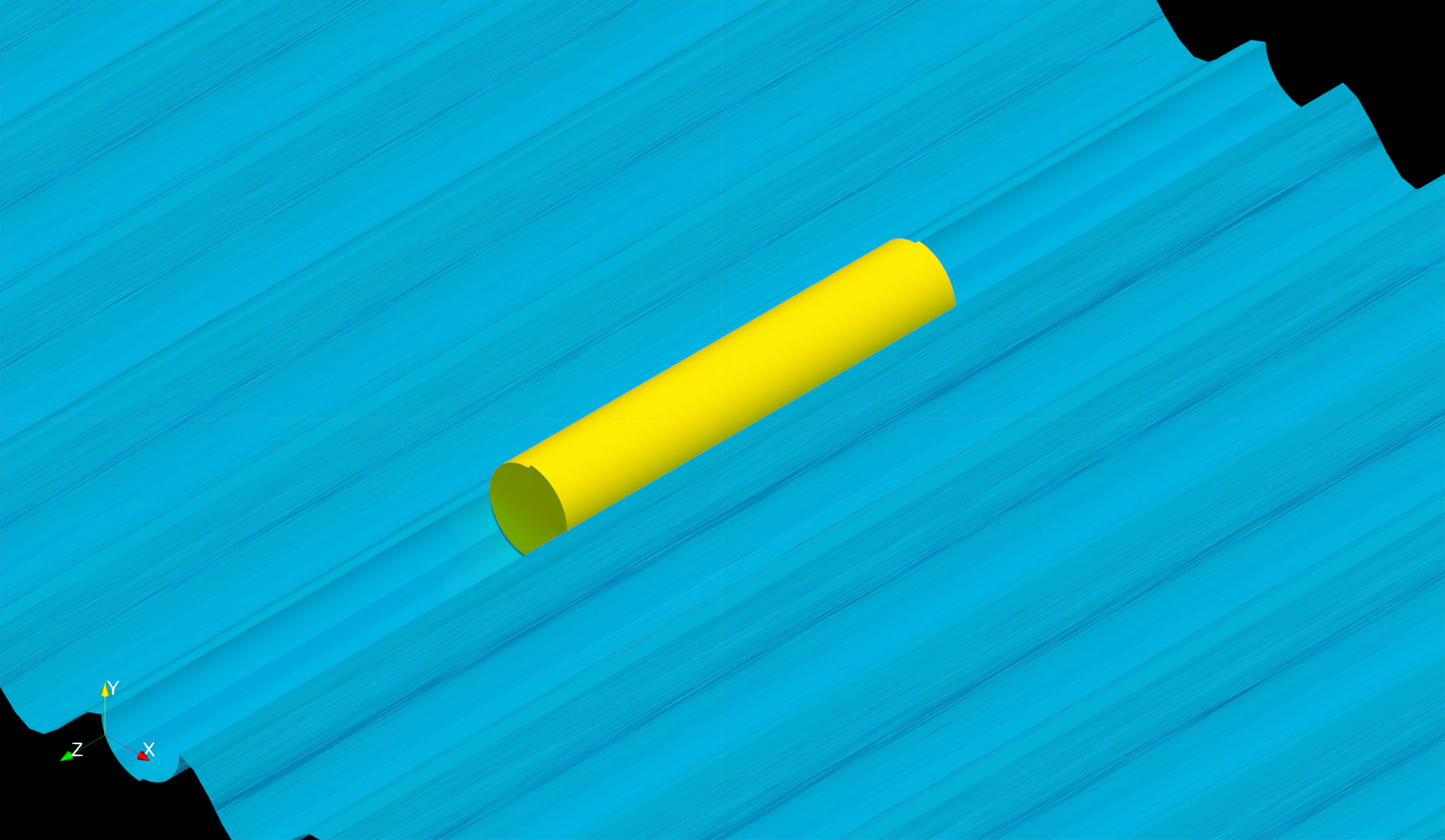
Fig. 10.8 An example of the warp by vector filter used. In this case, the data points of the wave elevation is shifted along the free surface. This is how the waves are created in the figure above.#