Improving visualisation#
When working with scientific data in Paraview, there are several techniques and filters that can help enhance your visualisations, making them more informative and easier to understand. Below are some common methods used to improve the clarity, realism, and interpretability of your visualisations.
1. Tools to improve visualisation#
1.1 Clip#
The Clip filter is used to extract a specific part of your data by cutting through the dataset along a chosen plane or a specified shape. This is particularly useful for examining cross-sections of a structure or isolating regions of interest. We can apply the Clip filter from the Filters menu (Filters > Alphabetical > Clip). In the Properties Panel, we can choose the clipping plane or box shape, and adjust the position and orientation to isolate the desired section of the dataset.
1.2 Texture / Ray Tracing#
Texture mapping and ray tracing are techniques used to enhance the realism of your visualisations. Texture mapping applies a 2D image or pattern onto a 3D surface to simulate the appearance of materials, while ray tracing simulates the interaction of light with surfaces to create realistic lighting effects like reflections, shadows, and refractions. To apply textures, select your dataset and navigate to the Properties Panel. Under the Display section, find the Texture option and load a texture image (e.g., a material pattern). Enable Ray Tracing by going to the Render View settings and adjusting the rendering options. You may need to enable advanced rendering techniques. Adjust parameters like Reflection, Refraction, and Shadows in the Properties Panel to fine-tune the realism of your scene.
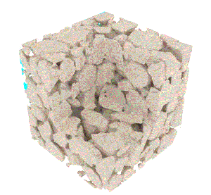
Fig. 10.9 Flow through a rock microstructure with ray-tracing. This is a good example of how clip, texture, and ray tracing can be used in Paraview. Sourced from the 4TU scientific visualisation database.#
1.3 Transparency#
Transparency is used to make parts of your data see-through, allowing you to view the interior of complex structures without obstructing the outer layers. This is especially useful when you want to examine internal features, such as internal flows or hidden structures, in a 3D model. In the Properties Panel, the Opacity slider is located under the Display section. We can adjust the Opacity value to make the dataset more transparent (values range from 0 for fully transparent to 1 for fully opaque). For better control, you can apply transparency to specific parts of your data (e.g., just the outer layers) by using the Clip filter in combination with transparency.
Use the slider to rotate the visualisation and see the transparency.
1.4 Animation#
Animation allows you to visualise how data changes over time or how different parameters evolve in your simulation. This is particularly useful for time-dependent datasets or for presenting dynamic processes. In the Animation View, you will see a timeline representing the different time steps in your dataset. You can play, pause, or scrub through the time steps. To animate specific filters or properties, go to the Properties Panel and adjust the Time Control settings, or modify parameters that you want to animate over time (e.g., opacity or glyph size). For more complex animations, use the Keyframe Animation tool to specify key moments in the timeline and interpolate between them. To animate filters, select the filter you want to animate in the Pipeline Browser, and click the Animation button to create keyframes for the filter’s properties. The camera can be adjusted dynamically by prescribing a specific path to follow. The simplest is otherwise to automatically create an orbital path. To do so, add a Camera/Follow Path item; click on the item created and select Create Orbit. To save the animation, go to File > Save Animation and select the desired file format.
1.5 Source#
The Source filter in Paraview is used to generate basic geometric shapes, objects, or even predefined data sources that can be used as the foundation for visualisations. These objects can be used as placeholders, input data, or starting points for more complex operations like filtering, visualisation, or simulation. In the Sources menu, you can select a shape to generate (e.g., Sources > Sphere or Sources > Cone). The selected shape will appear in the Pipeline Browser. You can adjust its properties such as size, position, and resolution in the Properties Panel. Modify attributes such as radius, resolution, and center point (position) for the shape to fit your visualisation requirements. Once you’ve configured the source object, you can apply additional filters or transformations to it as needed for your visualisation.
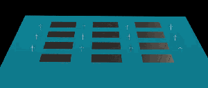
Fig. 10.10 Hydroelastic response of floating solar farm subject to regular waves. Just as we can use the source filter, complex objects like those wind turbines can also be imported directly in Paraview as STL files. This example illustrates how animations can showcase visualizations effectively. Sourced from the 4TU scientific visualisation database.#
1.6 Text#
The Text filter in Paraview is used to add annotations or labels to your visualisation. This is particularly useful for adding titles, axis labels, or explanatory text to highlight important parts of your visualisation. Text annotations can help viewers understand the context, significance, or interpretation of the visualised data. To add text to the visualisation, go to the Filters menu and choose Filters > Alphabetical > Text. In the Properties Panel, type the text you wish to display in the Text field. You can enter simple text or even combine it with expressions (e.g., data values). Adjust the position of the text in 3D space by changing the Position settings. Modify the font, size, and color as needed for visibility and aesthetic preferences.

Fig. 10.11 Text filter used to create a title in the visualisation#
2. Post-processing#
Post-processing in Paraview refers to the steps taken after initial visualisation to further manipulate, analyze, and refine your data. These processes can help you extract additional insights, perform calculations, or prepare data for further analysis. The following tools in Paraview are commonly used in post-processing workflows:
2.1 Calculator#
The Calculator filter in Paraview is used to perform mathematical operations on your data. It allows you to create new variables or modify existing ones by applying arithmetic expressions to the available scalar and vector fields in your dataset. This is useful for deriving new fields, performing data transformations, or simplifying complex data into more meaningful quantities. To use the filter, go to the Filters menu and select Filters > Alphabetical > Calculator. In the Properties Panel, under Result Array Name, type the name for the new field you want to create. In the Expression box, enter the mathematical expression. You can use available scalar or vector field names, along with operators and functions (e.g., sqrt(X^2 + Y^2) to calculate the magnitude of a vector).

Fig. 10.12 The calculator appears in below the Pipeline Browser. In the calculator section, we type the expression (including the vector field names) we want to calculate in the box.#
2.2 Python Integration#
The Python Integration in Paraview enables you to use Python scripts to extend the functionality of Paraview, automate workflows, and analyze data programmatically. Python is an essential tool for advanced data analysis, custom calculations, and interaction with Paraview’s API. It provides greater flexibility by allowing you to create custom visualisations, modify properties, and perform batch operations directly from within the Paraview environment. To use Python directly within Paraview, open the Python Shell from the View menu (View > Python Shell). You can then execute Python commands to interact with the Paraview pipeline, such as loading files, applying filters, and modifying visualisation properties.
Paraview provides a convenient way to automate your workflow by tracing your actions and saving them as a Python script. To do this, start by enabling the trace feature under Tools > Start Trace before performing any operations. Then, proceed to load your dataset, apply the desired filters, and create an animation or other visualizations as needed. Once you’re finished, stop the trace by selecting Tools > End Trace and save your recorded actions as a Python file. This Python script can then be used to replicate your actions automatically, making your workflow more efficient.
2.3 Resample with Dataset#
The Resample with Dataset filter in Paraview is used to resample one dataset onto another. This is particularly useful when you have multiple datasets with different grid structures or resolutions and need to align them into a common grid for comparison or analysis. It ensures that datasets with different geometries or resolutions can be brought into alignment for combined visualisation or further processing. From the Filters menu, select Filters > Alphabetical > Resample With Dataset. In the Properties Panel, under Source Dataset, choose the target dataset onto which the data will be resampled. Adjust any other properties as needed, such as resampling method options or specific data arrays to resample.
3. Data Analysis#
Data analysis tools in Paraview allow you to extract and visualise information from your dataset, such as trends, distributions, and relationships. These tools are essential for analyzing simulation data, scientific experiments, or complex visualisations. Two common tools for data analysis in Paraview are Plot Selection Over Time and Plot Over Line.
3.1 Plot Selection Over Time#
The Plot Selection Over Time filter allows you to visualise how specific data points or quantities evolve over time. This is particularly useful for time-dependent simulations, where you need to track the behavior of a variable at specific locations or regions throughout the entire simulation time. Apply the Plot Selection Over Time filter from the Filters menu (Filters > Temporal > Plot Selection Over Time). In the Properties Panel, choose the selection or region of interest in your dataset (e.g., a specific point, cell, or volume). Click Apply to generate the plot.
3.2 Plot Over Line#
The Plot Over Line filter allows you to extract data along a specific line or path within your dataset. This is helpful for analyzing variations of a particular quantity (e.g., temperature, pressure, velocity) along a defined line, such as a cross-sectional profile or measurement line in your dataset. Apply the Plot Over Line filter from the Filters menu (Filters > Data Analysis > Plot Over Line). In the Properties Panel, define the start and end points of the line along which you want to extract data. You can input coordinates directly or use the graphical tools to click and place the line in the 3D view. You can specify the quantity you want to analyze along the line, such as a scalar or vector field.
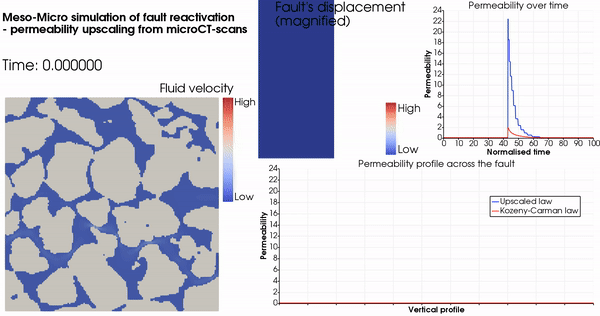
Fig. 10.13 Data analysis: plot selection over time and plot selection over line in one visualisation.#