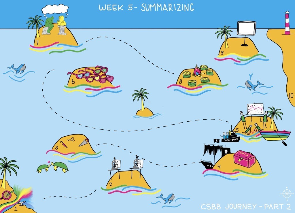
Week 2.5: Data Analysis Theory and Practice#
One of the key components of research is how you present your findings to an audience. One effective way to communicate in science is to tell a concise and impactful story about your research. Often research projects generate a lot of ideas and outputs. The volume and the complexity of these outputs can get in the way of telling your story. This week will focus on how we summarize information by analysing and presenting data using visualisations.
This format is a powerful tool but can have constraints. Visualisations should be simple and clear. Therefore, you need to carefully select the best type of visualisations to convey the message of your data. Some important questions to ask are what to include? What is relevant? What can help explain your ideas? And what might make them confusing or misleading?
Monday: This week, there is no science spotlight or a Monday workshop. This will allow you more time to focus on your research project.
Wednesday:
Workshop: Data Analysis and Visualization
Friday:
Friday Symposium
Workshop: Data Analysis and Visulization#
A core task in research projects is data collection and analysis. Effectively communicating results derived from data analysis is often as important -and requires as much planning- as the data analysis itself. During this session, we will focus on data and results communication using visualizations.
During this workshop, you will familiarize yourself with the guidelines for effective data vizualisation in the scientific research setting. We will discuss important principles of research data vizualisation. You will also get the opportunity to practice with visual data representation techniques, tools, and styles to best tell your story. You’ll also learn how to rid your visuals of ambiguous and misleading elements.
Although teaching statistics and bioinformatics is outside the scope of this workshop and this minor, we would like you to keep an eye on the big picture: You must be able to document and justify your data analysis choices as well as reflect on possible alternatives.
Key Concepts#
Write an analysis plan before you start analysing your data.
Think about alternate methods of analysing data
Cleaning data — what and when and keeping original data.
Guidelines for Scientific Research Data Visualization
How to pick the right vizualisation for my data to tell my story
How to use style and color to highlight important features in data
Learning goals#
Effectively communicating data and results
Choosing the most effective data visualizations
Using effective style for their visualizations
Recognize and avoid bad or misleading practices in data visualization
Group Activity of the Week#
Continue with research. Write your data analysis methods section. Look at how they have been written in the various papers you’ve read.
Discussion Questions#
What are ethical considerations in data analysis?
How can data be misrepresented by the type of visual used?
Why does making an analysis plan before you start collecting data matter?
As you progress in your project, do you find it’s changing?
How are you planning on analyzing your data? What other ways could you do it?
What questions do you have about the other projects?
Have you figured out something that might help other groups?
Do you have a question that other groups could help you with?
Weekly Submitted Assignments#
Group#
Write a data analysis and visualization plan
Individual#
What are potential problems with or considerations in your data analysis plan and visualizations?